- false colour imagery and dust cover for the last week
- carbon monoxide and SO2 measure up- and down-current for the last three days

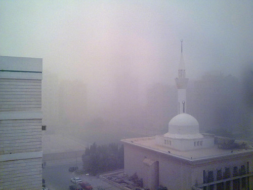
As they say in Australia, 'isn't that a beaut'? And keep coming back to refresh the map, this is as good as it gets: near real time data updated on a rolling basis for the last 3 - 7 days (watch here for updates and notices). I'm naturally interested in dust storms in the Middle-East (or haboobs as they they call them in the US West too), so I got the map above : all calm on the eastern front, it was humidity not dust in the Arabian Gulf yesterday! The photo below shows what it looked like in Kuwait City over Easter.
You can also post other layers, or even go fetch other data as Goddard updates its services. Since this is all live web data, it's a perfect fit for a web map that automatically updated as you post it or refresh it, don't you think? I'll let you know as soon as I get it working on ArcGIS Online. As they say, 'don't touch that dial... we'll be back shortly!'.
No comments:
Post a Comment
Thank's!