It always sucks to show up to a conference with a slide deck that looks lovely with lots of pictures and evocative hipster stock photography all nicely formatted for a 4:3 ratio (1024x768 pixels is common) and then find out their projectors are 16x9 and run something like 1280x720 pixels.
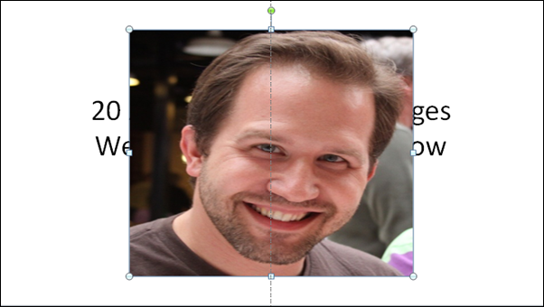
Nobody wants to be THIS stretchy guy:

It is true that some people have a genetic inability to see that 4:3 content has been uncomfortably stretched to fit a 16:9 screen. We have a name for these people. They are called "Bad People.™"*
As an aside, there are few sadder technical things than 4:3 content stretched across an expensive 16:9 widescreen HDTV. From electronic stores to hotel lobbies, airport status displays to café menus. Make it stop.
What's the easiest way to convert your 4:3 slide deck to 16:9 in a pitch and still have your images look nice? There' s a number of ways on the internet but they all involve "math" and "ratios" and "thought." Nonsense. Too hard. Here's what I do.
Step 0 - Switch to 16:9 and see bad images.
Click Design | Page Setup and switch from 4:3 to 16:9. Other folks say to enter in custom numbers and do multiplication. Hang in there, this is easier.
_fce5c215-1b4f-42e4-a3d6-16526e86c325.png)
At this point, all your images WILL be stretched out.
Step 1 - Fix image ratios without messing up their sizes
Here's the trick. Right click on an image and select Size and Position. From this dialog, click in the Height box. Now, just click up once and down once. As long as the Lock Aspect Ratio checkbox is checked, just changing the scale by 1 step and then switching back will fix your image. You can do it with your keyboard even faster.
_b0b972e9-e488-4d4e-9afa-eadc21560dee.png)
Here's trick #2. You don't need to close the Size and Position dialog. It's modeless. You can leave it open and go from slide to slide quickly changing your images. Just click the image, click Height, then up/down, then do another image. Repeat until it's all done. It'll take just a few seconds per slide.
_a5608596-cac4-4cf3-9169-89c6aa3c469a.png)
This trick will fix all your image ratios, but expect to do one more pass to make sure that you're using all the space afforded by this new widescreen layout. Regardless of how you images are sized you might want to make some tweaks to the layout and spacing of your text and images.
How to you switch your slides from 16:9 to 4:3? Exactly the same steps except adjust the ratio in Step 0.
Hope this helps someone.
* They aren't really bad people. They are good people with bad presentations. Relax. It's a blog post.
© 2011 Scott Hanselman. All rights reserved.
No comments:
Post a Comment
Thank's!