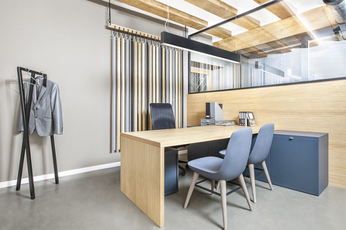
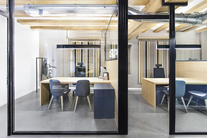
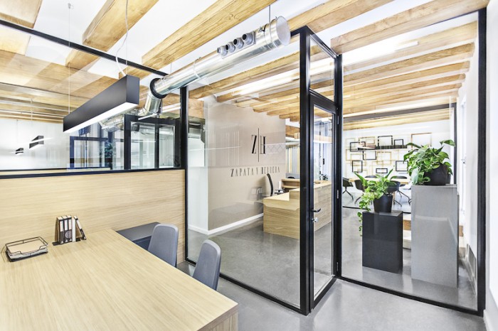
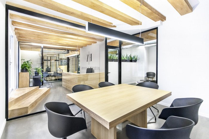
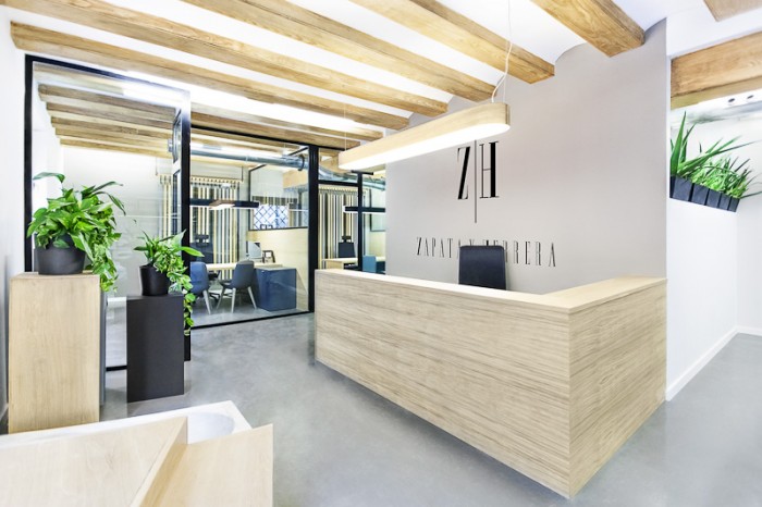
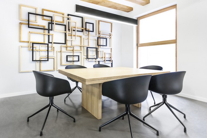
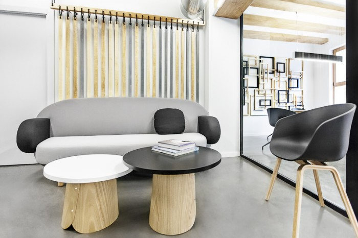
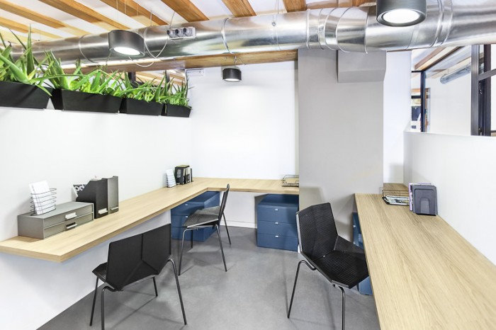
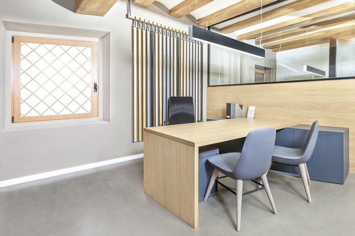
When it comes to traditional law office design, I tend to think of stuffy rooms filled with walls and walls of books and leather furniture. The offices of Zapata & Herrera are the exact opposite.
Designed by Masquespacio, today’s offices present us with the opportunity to consider the use of office design to set the tone for an office. Law offices should clearly be professional spaces that carry some air of sophistication, but do they always need to be thought of in the manner I described above? Clearly not.
Here is a brief from the designers:
“Development of a space that represents the essential values through the use of different colors that symbolize seriousness, professionalism and confidence. The colors are applied repeatedly through the different used materials. Not wanting to fall into usual clichés of the lawyers offices a bunch of elements are used to convert them into metaphors. Zapata & Herrera can be considered as an example of a corporate space that transmits the employees’ work, highlighting their seriousness, professionalism and confidence, with a vanguardian look unusual for a lawyer’s office.”
The office is located in Valencia, Spain.
Design: Masquespacio
Related content:
- Browse By Location
- Hult International Business School – Great Casual Seating Areas
- Office Snapshots Business Cards
- Colorful Conference and Meeting Spaces in London Financial Office
The post Zapata & Herrera: A Law Office Like No Other appeared first on Office Snapshots.
DIGITAL JUICE
No comments:
Post a Comment
Thank's!