I have been toying around with a copy of Windows 8′s Release Preview on my second desktop system for a while now, and have gotten used to the Metro interface rather quickly. I specifically like the new way of searching and what the Windows Store has to offer. There are definitely a few quirks here and there, and some things that I would have designed different. In this article, I’m going to look at some of the options that I feel are missing. I do not have high hopes that anyone from Microsoft will comment here on this site, as the company has been largely ignoring it for the last six or so years of its existence.
1. The order of tiles

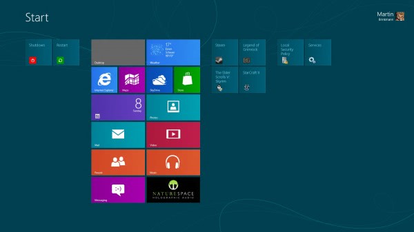
You can move Metro tiles around by dragging and dropping them to another location to customize where items appear on the start screen. When you drag and drop one or multiple Metro tiles around, you will notice that they are automatically placed underneath a column’s existing tiles, or on the right of it if adding the new tiles would exceed the column tile limit.
What you can’t do is leave gaps in the interface. If you look at the screenshot above you notice that I only have two Metro tiles on the left. I would move other tiles there, but only if I could leave a horizontal gap between the existing tiles in the column and the new tiles that I want to move there.
I can do that on the Windows desktop, where I can move the desktop shortcuts around into locations that I want them to be in without them snapping back to the next icon automatically.
2. Tile colors

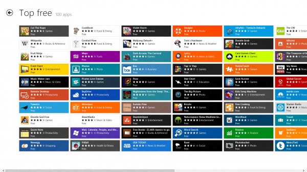
There is no way to change the color theme, or the color of individual tiles in Metro. For me, there are simply too many colors in Metro, and I’d like to have a way to reduce the colors that are used to make it more eye-pleasing for myself. This is actually not just a problem of the start screen, but also of Windows Store where it is really difficulty to concentrate on individual items because of the color explosion there.
Give me options to display tiles in a certain color scheme, or black and white only. I do understand that this is not as hip and lively as the full color experience, but since I want to work with the operating system, I prefer usability over looks any time of the day.
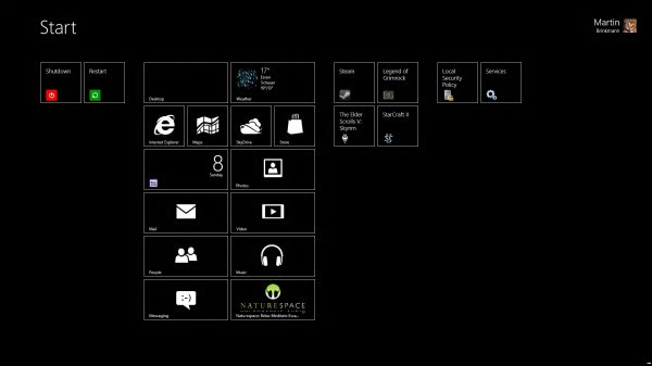
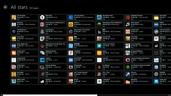
What I’m looking for is something like what the high contrast theme is offering, only not that minimalistic.

The store is still to colorful for my liking in the high contrast theme, making it hard to concentrate on the app titles.

Custom tiles on the other hand should have personalization options. They are all displayed in green on the screen, and there should be options to make them stick out as well if that is what a user wants.
3. Remove/Hide Start header
When you look at the Metro start screen, you see the header area at the top that is basically just displaying a Start title and on the right the username and profile icon that you can use to switch users, lock the screen or sign out. It would be really nice if one could automatically hide that header to make more room for additional Metro tiles there. There is not really a need for the Start title there, and the lock, sign out and account switching options are also available elsewhere.
Closing Words
Have you had a chance to work with the new Metro interface? Have you identified areas where it needs improvement?
DIGITAL JUICE
No comments:
Post a Comment
Thank's!