Hi there, i’m marcos ojeda, a designer at Khan Academy. Let me tell you about Topic Badges.
A while back, Ben and Jason started work on revamping our exercise framework to allow multiple exercises to be grouped under the umbrella of a Topic. Jason asked me if i’d be interested in making some badges for these new higher-level topics and i eagerly agreed.
The task is pretty amazing when you first hear it: “make some icons that represent math topics like ‘addition and subtraction’ or ‘functions.’” I immediately turned to some of my favorite representational gotos, namely isotypes, Japanese Mon and Brian Eno. And naturally there’s a whole history of people trying to synthesize a concept into a single icon, so prehistoric cave painter, i tip my hat to you.
Starting points
For my attempt, i basically started doodling until a workable concept began to ossify. The standard i set for myself was something between the golden record
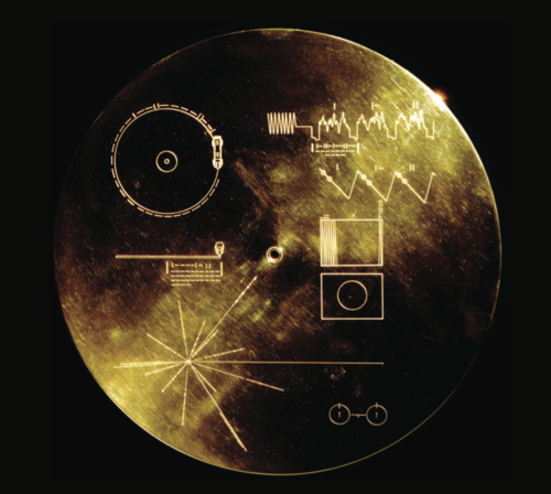
whose goal was to be a sort of message in a bottle to far-off lifeforms. The cover, shown above, is a sort of puzzle-explanation which, when decoded, explain how to use a cartridge (included!), as well as showing the location of earth. All without words. An explanation of the record shows exactly how much information is embedded within it.
Additionally, i took as inspiration the sorts of reference diagrams you tend to find in pre-war textbooks
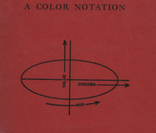
for example, this book cover shows a concise representation of the Munsell color system whose core units are hue, chroma and value.
Additionally, i love the genre of “this coincidentally heraldic diagram represents everything about this course” that you tend to find in math and science classes, like this classic one which sneaks in a fixed point combinator alongside a supremely visual description of recursion:

or this gem from the back of Strang’s linear algebra textbook
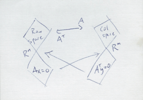
whose true intention and significance only really makes sense towards the end of your first linear algebra course.
The common thread between all of these is that the symbol itself is grokkable, you can get it as a thing, but its true meaning is somewhat opaque until you understand enough of the subject for the icon to represent the relevant salient details. Since we are in the business of helping folks learn concepts, it seemed right to have badges which became more interesting the more you learned.
Topic badges
As it happens, here’s what ended up happening for, addition and subtraction exercises (q.v. the addition and subtraction topic page).
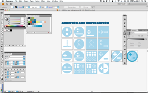
Notice that it spans the gamut between visual puns representing addition and subtraction to literal visual representations of dots being grouped and so forth.
For a topic like exponents (which isn’t yet available), you end up getting the more out of the box style treatments that begin to have that sense of mystery to them (some of them even making no direct connection to exponents at all.)
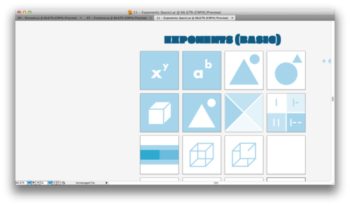
The not-so-obvious-to-me lesson here, is that sometimes trying to distill a topic will fail if the topic is too broadly specified. This is also, exactly why things like the noun project succeed at things like sasquatch but do less stellar with things like blog.
Go back and take a look at the visual solutions for Addition and Subtraction, a topic that is incredibly broad, and contrast that with the sorts of visual treatment for Exponents. As a secondary check, i think, if it becomes difficult to distill a topic without resorting to using its dominant operators, then the topic is probably too broadly specified (maybe we should have an addition topic? or grouping? who knows!)
All the badges
The result of all this topic-level navel-gazing was, at present count, 45 separate badges (of which only 28 are currently deployed):
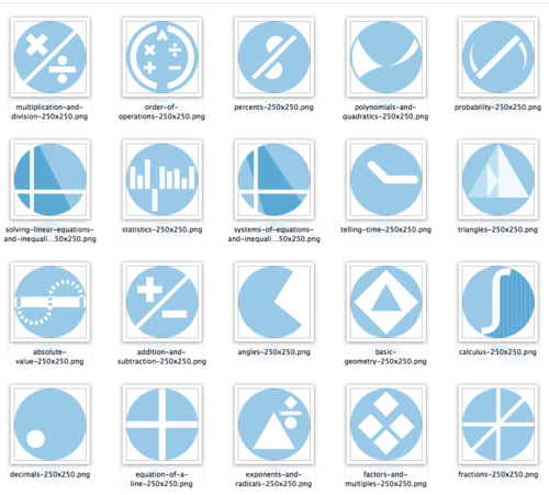
and at a glance, all the badges here:
For each topic, there’s a regular badge and then there’s a completed badge which is rendered as a gloriously shiny button or token.
Some technical details
Despite the fact that this seems like a straightforward doodling project, there were some technical issues to deal with:
- the round badge shape was not predestined, for quite a while i assumed we would crop the square to a circle using css rounded corners as a lo-fi mask, but for various reasons it eventually made sense to actually generate circular images
- i am using illustrator’s artboards liberally
- illustrator files don’t play nicely with most code review systems or git/hg/whatever and make it difficult to get code reviews.
Round files are a delicious curse
Illustrator files (namely their artboards) are transparent. When exporting (or saving for web) you have the option to mark the artboard as transparent, which would make round pngs trivial, right?
Lamentably, save for web is a sort of painful mouse-heavy rigamarole and if you’re trying to batch-export a bunch of badges at, say, a new size, i would rather not be on the hook for clicking over and over again. (would you?)
To that end, i wrote a small script to control graphicsmagick with ghostscript to render illustrator files at arbitrary resolution. How? It turns out illustrator files are almost entirely pdf files but with extra information for storing illustrator metadata.
Artboards are great!!
Since CS4, artboards in Illustrator are the best feature. Remember how i mentioned that illustrator files are basically pdfs in hiding? You can leverage this in order to both save divergent copies of a given illustration in the same file and also to share this information with others.
Artboards in illustrator are represented as pdf pages with their own dimensions, so this makes it trivial to share illustrator files once people know to open them with a pdf-compatible application and comment on a given page.
This also means that the first illustrator rendering script can be amended to know about artboards and what they contain. So the file has evolved somewhat to include this functionality. There’s a json file which marks which artboards are for what purpose and somebody without illustrator could actually pull down the repo and generate badges if they felt like it.
But what about code reviews?
It’s no fun to do work but not get any good feedback. You can get stuck in a rut and it’s always good to have a separate pair of eyes, but unless you want to be a hovering art director, the process of providing crit for files which are clearly works in progress is a bit awkward.
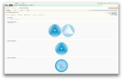
In order to get around this, I used the Mac FSEvents python library to watch over my project folder and commit the whole directory each time I hit save from within illustrator. The script which does this also lives in kiln and is called artboard.py. The result, though is that instead of obtuse commit messages, it provides some context of what changed from commit to commit.
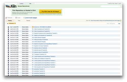
and more interestingly, since i can have the script render on each save as well, i can take advantage of kiln’s visual diff tools, so that i actually can get valuable feedback on a given changeset or just share some changes with anyone who’s interested.
There are a bunch of small hacks between the different rendering scripts to improve edge rasterization with transparency (involving some absurd downsampling) and to create fast previews depending on what the image is for. The tangible result ends up being that it was possible to open up the design and production process to be both flexible and open.
Final points!
I know many people have reservations about using Illustrator for icon design when it gets rendered down to a tiny image. Fair enough, but also, there’s something to be said for balance benefit and cost. For now it’s an acceptable loss, but it would be nice if vector artwork could be hinted like typefaces are. In some ways, a consistent badge family shares lots of the same design properties a typeface does, so maybe type design is a better way to go about thinking about things like…
i did not obey whatever golden rule that says that the smallest stroke in an icon should be 1/20th the width of the icon’s bounding box, but i should have, because it would have made them all uniformly legible.
It was a great process and I look forward to tuning, revising and creating new badges as we work to refine the size and design of our topics this summer. Thanks for making it this far!
DIGITAL JUICE
No comments:
Post a Comment
Thank's!