Custom-built dialogs are common in web-based applications, but many are not accessible. Most of them are not announced to assistive technologies, and so screen reader users are not made aware that a dialog has been launched. Many are also not focused when they are launched, and so keyboard-only users are still focused on elements in the background, and might have to navigate through the content in order to reach the dialog.
The WAI-ARIA specification defines roles and attributes that help ensure dialogs are announced correctly to assistive technology users, and provides guidance on ensuring they are keyboard accessible.
WAI-ARIA Dialogs
WAI-ARIA provides the dialog and alertdialog roles to define dialogs. The
dialog role is used when the user is expected to provide data, and the alertdialog role is used to announce the contents of a dialog to the user.The container element for both
dialog and alertdialog should use aria-labelledby to identify the element containing the accessible name for the dialog (usually, the heading). This is announced when the dialog first receives focus, along with the role of dialog so the user understands the context. The aria-label attribute may be used if there is no heading in the dialog, but all dialogs should contain a visible heading.
Using the alertdialog role
Authors should use the aria-describedby attribute to identify the message of an
alertdialog. When the dialog is displayed, focus should be placed on an active element within the dialog, such as an OK button.Consider a simple dialog with a list of instructions for shutting down a system.
Shutdown dialog
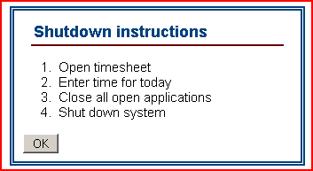
The container for the dialog should have a role of
alertdialog, with the aria-labelledby attribute containing a value that matches the id attribute value for the heading, and the aria-describedby attribute containing a value that matches the id attribute value for the description.Design pattern for an
alertdialog<div role="alertdialog"
aria-labelledby="dlgtitle"
aria-describedby="instructions">
<h1 id="dlgtitle">Shutdown instructions</h1>
<ol id="instructions">
<li>Open timesheet</li>
<li>Enter time for today</li>
<li>Close all open applications</li>
<li>Shut down system</li>
</ol>
<div>
<input type="button" value="OK">
</div>
</div>
Using the dialog role
When a role of
dialog is used, screen readers automatically go in to application mode. This shouldn't be a problem, as the dialog role should be used for getting data from the user, and screen readers usually automatically go into forms mode when interacting with form controls. Consider a dialog for the user to signup to a newsletter. As with the alertdialog example, focus should be placed on an active element within the dialog; in this case, the "Email" edit box.Dialog for user to signup to newsletter
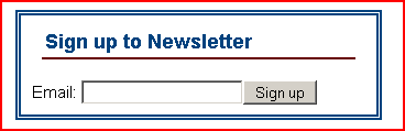
The container for the dialog should have a role of
dialog, with the aria-labelledby attribute containing a value that matches the id attribute value for the heading.Design pattern for a
dialog<div role="dialog" aria-labelledby="dlgtitle">
<h1 id="dlgtitle">Sign up to Newsletter</h1>
<div>
<label for="email">Email: </label>
<input type="text" id="email" name="email">
<input type="button" value="Sign up">
</div>
</div>If we add instructions to the newsletter signup dialog, a screen reader user wouldn't be able to use their reading keys to read the instructions, as the dialog is displayed in application mode. For this reason, instructions and cues should be programmatically associated using the aria-describedby attribute.
The following example includes instructions, which are programmatically associated to the "Email" edit box using
aria-describedby.Dialog to signup to newsletter with instructions
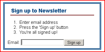
The email address now requires the
aria-describedby attribute containing a value that matches the id attribute value for the description.Design pattern for a
dialog with instructions<div role="dialog" aria-labelledby="dlgtitle">
<h1 id="dlgtitle">Sign up to Newsletter</h1>
<ol id="instructions">
<li>Enter email address</li>
<li>Press the 'Sign up' button</li>
<li>You're all signed up!</li>
</ol>
<div>
<label for="email">Email: </label>
<input type="text"
id="email"
name="email"
aria-describedby="instructions">
<input type="button" value="Sign up">
</div>
</div>There shouldn't really be a scenario where a screen reader user would need to interact with content in a
dialog using reading keys, but if there is, the content that requires reading keys should be placed in a container with a role of document. For example, if the dialog contains a data table, then the data table should be in a container with a role of document so that screen reader users can use their table reading keys to interact with the table, although a data table in a dialog is likely a sign that the design of the dialog is incorrect.
Modal and non-modal dialogs
A modal dialog is a dialog that retains focus until the dialog is closed or dismissed. It should not be possible for keyboard-only users to accidentally tab into the background content when either a modal or non-modal dialog is displayed. With a modal and non-modal dialog, the user should either explicitly dismiss the dialog (for example, selecting "Cancel" or pressing ESC) or close it by taking a positive action, such as selecting "OK" or "Submit". With a non-modal dialog, the user should also be able to use the F6 key to switch between the dialog and the main content.
Further reading
- WAI-ARIA Authoring practice design pattern for a modal dialog
- WAI-ARIA Authoring practice design pattern for a non-modal dialog
- Hans Hillen's dialog widget example
DIGITAL JUICE


No comments:
Post a Comment
Thank's!