Yesterday, I released a new Mac OS X app I’ve been working on for the last couple of weeks: Sticky Notifications. It lets you create quick notes or reminders as persistent notifications, in either Notification Center (on Mountain Lion 10.8 or later) or in Growl (on Lion 10.7 or later).
I find it very useful for jotting down a quick note of what I was doing when I had to switch tasks or leave my Mac temporarily, to refresh my memory when I get back. You can download and try it for yourself, and you can buy a license for just $3. I encourage you to take a look (it’s a nice way to support my writing here too).
In this article, I’m going to talk about the “second 90%” of the work involved in creating the app; the extra stuff we do to make the user’s life just a little bit easier.
It’s the little things
Writing the actual core functionality of an app is usually the easy part. No, really - it is. Making the app approachable and palatable to the user is the annoying, time-consuming, empathic, difficult part. It takes much longer too.
The ‘polish’ work for Sticky Notifications (“SN” henceforth) took more than twice as long as its basic functionality, which is simple. Exposing certain options (as few as possible) as preferences, crafting a first-launch experience, thinking about licensing and registration; these things take time and effort, and are the distinction between a negative or indifferent experience, and a positive one.
Let’s talk about the user’s journey with the app, in approximately the order they’ll encounter its various aspects.
Launching
The thing about launching apps is that they should launch. This is deep wisdom indeed. On Mountain Lion, there’s a thing called GateKeeper that’s on by default (you can also activate it on Lion 10.7.3 or later, but it’s not on by default so we can safely ignore it here).
What GateKeeper does is prevent the user from casually launching apps that aren’t:
- From the Mac App Store, or:
- Signed with a Mac Developer certificate from Apple.
That’s the default setting. People can change it, but the vast majority of them won’t (and rightly so). People can also still launch your app by right-clicking on it, choosing Open, and accepting the scary warning, but again - that’s not something you want to put your users through.
So, you need to sign your app. If you don’t, Mountain Lion users (an ever-increasing number of people) will see something horrible like this when they try to launch it:
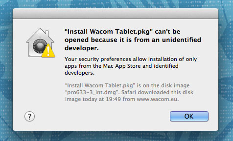
Mountain Lion’s "unidentified developer" dialog
Terrifying stuff. It has a thing that looks like a safe (and a house), and a yellow warning triangle, and lots of blurb about “security” and “identified developers”. No thank you very much, madam. I think that most normal people would see this and think “virus!” or some such thing.
So, again: sign your apps. People will still see a dialog, but it’s a dialog that lets you run the app, and isn’t quite so scary. You’ll indeed need to pay the yearly subscription to be a Mac Developer in order to do so, but the $99 is cheap compared to the number of users you’ll probably lose due to the Dialog of Fear.
First launch
SN is a menubar app (it doesn’t appear in the Dock, or the application switcher), so it can very easily “disappear” if you don’t know to look for its menubar icon. A first-launch Welcome screen was clearly in order. I tried to keep it as brief and inviting as possible.
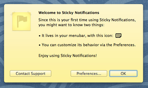
Welcome screen
The Welcome screen appears only once, and provides an immediate place to contact support if you need to (there are others too).
Main window
This is where the action happens; the New Notification window. When the app isn’t registered, there’s also a Buy button to the left of the Cancel button.
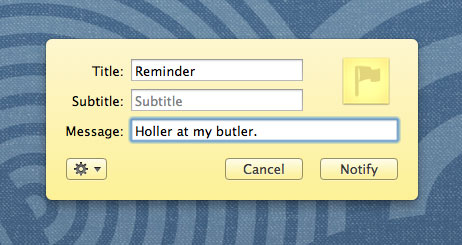
Sticky Notifications
I was trying to evoke both a yellow sticky note, and also the system-wide “tweet sheet” in Mountain Lion (and iOS), since I think of SN as a globally-available utility.
Notifications
If you’re using Mountain Lion, this is what a notification looks like. It’s not exactly pretty, but it’s functional. If you choose to use Growl (and/or if you’re on Lion instead), you obviously have endless customisation options via Growl’s own themes.
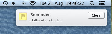
A notification
As its name implies, the notifications from SN are configured to be “sticky” (alerts, requiring to be dismissed manually, rather than banners which go away by themselves) by default.
Preferences: General
Just a single option here, but one you’ll definitely want to configure: the global keyboard shortcut. This is about 50% of SN’s usefulness for me, personally. I didn’t set an initial default because I frankly think that’s a bit rude.
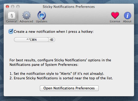
General preferences
There’s also some explanation of how best to configure your Notification Center options for the app, with a handy button to launch the relevant pane of System Preferences.
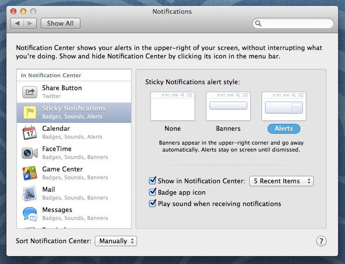
Notifications pane in System Preferences
I tried hard to keep the tabs of SN’s Preferences window as short as possible without being cluttered. You never know who’s on an 11” MacBook Air, and too many apps have windows that are partially off-screen on such devices.
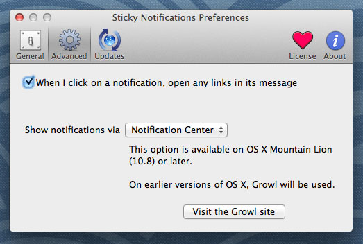
Preferences: Advanced
Here we come to a rather nice little feature: automatically opening any URLs in a notification’s message, when you click on the resulting notification. It was suggested by my friend Neil (@neilinglis), and I immediately realised it’d be a good addition to the app.
Advanced preferences
The URLs are recognised via Apple’s own Data Detectors, so not only will it recognise partial URLs like “apple.com” or “me@somewhere.net”, but the feature will improve as Apple updates the underlying functionality.
You can also choose (on 10.8 or later) whether to use Notification Center or Growl for the notifications; on 10.7, you’re naturally compelled to use Growl.
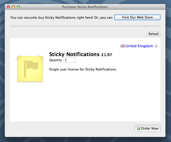
In-App Store
Since this isn’t an App Store app (it remains to be seen whether Apple will approve it), I needed to provide my own licensing and store - I use FastSpring as my e-commerce provider, and they have a nice Cocoa (and Windows, for that matter) SDK for embedding a store inside your app.
In-App Store
The most important aspect for me was that, at the conclusion of a purchase via the in-app store, the app should be registered immediately, and not require any further faffing-around.
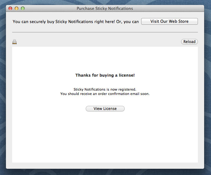
Automatic registration
It’s a much nicer experience for the user, and I’m pleased with how it turned out. You can of course choose to use the regular web store instead, if you prefer.
License emails
Regardless of whether you order via the in-app store or the web store (it’s about 50% each way for those who have bought the app so far), you get a confirmation email with your license info. I decided to add a little bit of emotion and whimsy into those emails, because most examples I’ve seen are so cold and businesslike.
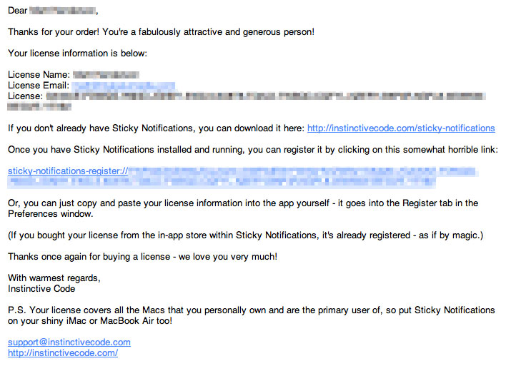
License email
When someone has just given you money, I think it’s nice to show a bit of enthusiasm, and maybe inject just a light touch of humour or even affection into the proceedings. People who buy software let us keep doing what we love, after all.
(I also explicitly mention that the license is good for all of your own machines. A few lovely people do actually think about that, and ask whether they need to buy an extra license for their laptop. I love those people. I think it’s only fair to let you run the thing on all of your own machines!)
URL scheme
SN’s license keys are quite long, as you can see - you wouldn’t want to have to type that stuff yourself (a lot of apps disable the “Paste” function in serial number fields, ostensibly to combat piracy - they’re hurting actual customers too).
Besides letting people paste their license keys in, a nicer solution to the problem is for the app to support a custom URL protocol, so that you can click a registration link (say, from your order confirmation email), and the app will then register itself automatically. It’s trivially easy to do, and will hopefully make the customer smile a little bit when they realise they don’t have to type their name and email address yet again today.
Registration and emotion
I googled for suitable icons for the “Register” pane (and button), and all the results were dollar-symbols or cash registers or credit cards. I find that horrible. People are already reluctant to part with their money, and I think it’s a bit impolite and off-putting to shove the transaction in their face. The delicate matter of the bill doesn’t have to be so cold and mechanical.
I like people who pay for things, and I certainly like people who give me money, so I decided to go with a love-heart instead. SN frames the entire idea of buying a license as a “like” or “demonstrate affection” scenario. The “Buy Me” button (anthropomorphising the app) and the “Register” tab in the Preferences window are both adorned with love-hearts. Yes, it’s twee and schmaltzy and maybe makes you feel a bit sick, but it’s a lot nicer than a Visa logo. And, the sentiment is entirely genuine on my part - it feels great when people validate your work by paying for it.
(Somewhat sneakily, the strong association of the colour red with love lets me make the Buy button extremely visually ‘loud’; much moreso than I’d have dared if I’d used a more conventional icon.)
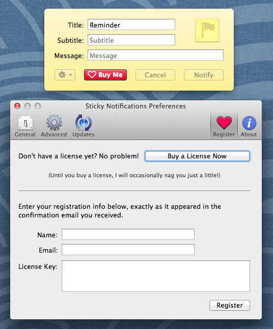
Unregistered
(The nagging it refers to is a gentle reminder - via a notification, naturally - to register. They happen no more than once a day, and only at the time you’re actually using the app to make your own reminders; it would be exceptionally rude to nag you at other times. I thought that was sufficiently gentle. Clicking those nag-notifications will bring you to the Register pane immediately.)
Once you’ve registered, you even get an extra love-heart, and another little compliment that you can look at whenever you like. You attractive person, you.
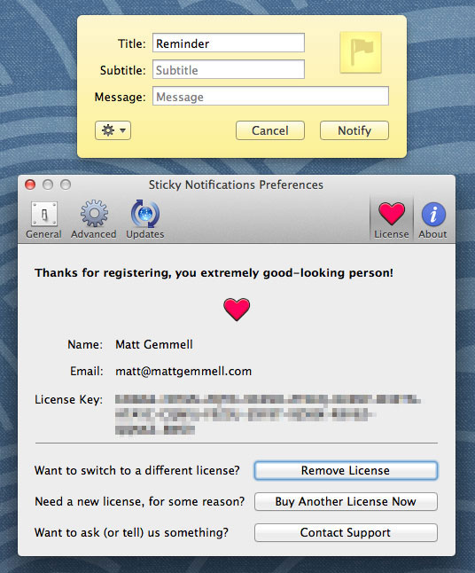
Registered
It’s a bit of fun, it humanises the app and those who made it, and people do genuinely enjoy it.
pro tip: want more of my money? tell me how awesome and good looking I am.well done@mattgemmell
— David House (@davidahouse) August 22, 2012
This is what good#UX looks like :) > Sticky Notifications for Mac OS X by@mattgemmell bit.ly/PFe9h3 twitter.com/Grinblo/status…
— Evgenia Grinblo (@Grinblo) August 22, 2012
Making my own life easier
Apple notoriously only allows 50 promo-codes per version of an App Store app, but I’m under no such limitation here. I can give free licenses to friends, respond to journalistic requests for licenses, and even hold giveaways whenever I want.
The days following a release are always hectic, and your mental energy is probably low, so the last thing you want is to be fiddling about trying to create licenses (or making mistakes when doing so).
Whilst I was implementing the licensing system, I also created a quick tool - which took all of ten minutes - to let me generate and validate both licenses and the aforementioned quick-registration URLs. (When you buy a copy, the online or in-app store naturally generates and emails your license instantly; this tool is just for my own use locally.)
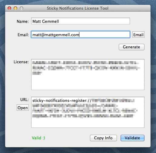
License generation and verification tool
I keep it handy here for when I want to send out (or check) a license for any reason, but can’t be bothered launching Xcode or using the terminal. It even creates the whole email for me.
Final thoughts
I’ll be writing a further article, more focused on the specific components I used and some of the things you need to do when you’re releasing an app outside of the App Store, so keep a look out for that soon.
With Sticky Notifications, I made a concerted effort to follow my own advice: focus less on functionality, and more on ways to make the experience smoother, easier and more enjoyable for the user. They’re paying you to take some of their problems away, not to give them more.
I’m @mattgemmell on Twitter. If you’d like to try Sticky Notifications, you can find out more about it (and download a copy) here.
DIGITAL JUICE
No comments:
Post a Comment
Thank's!